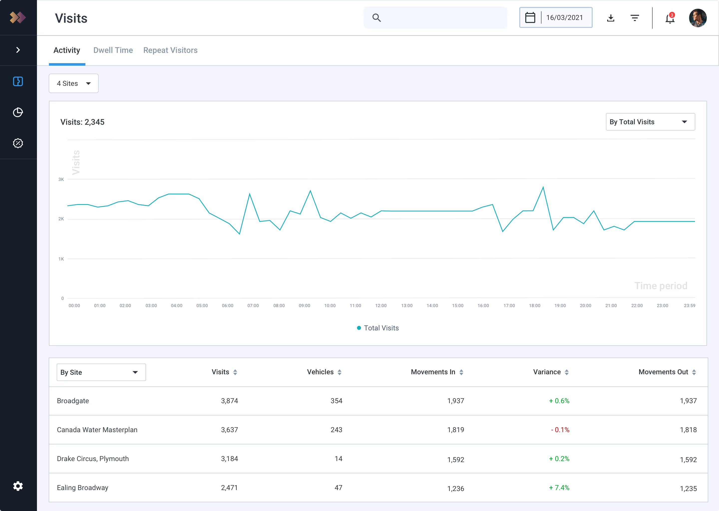
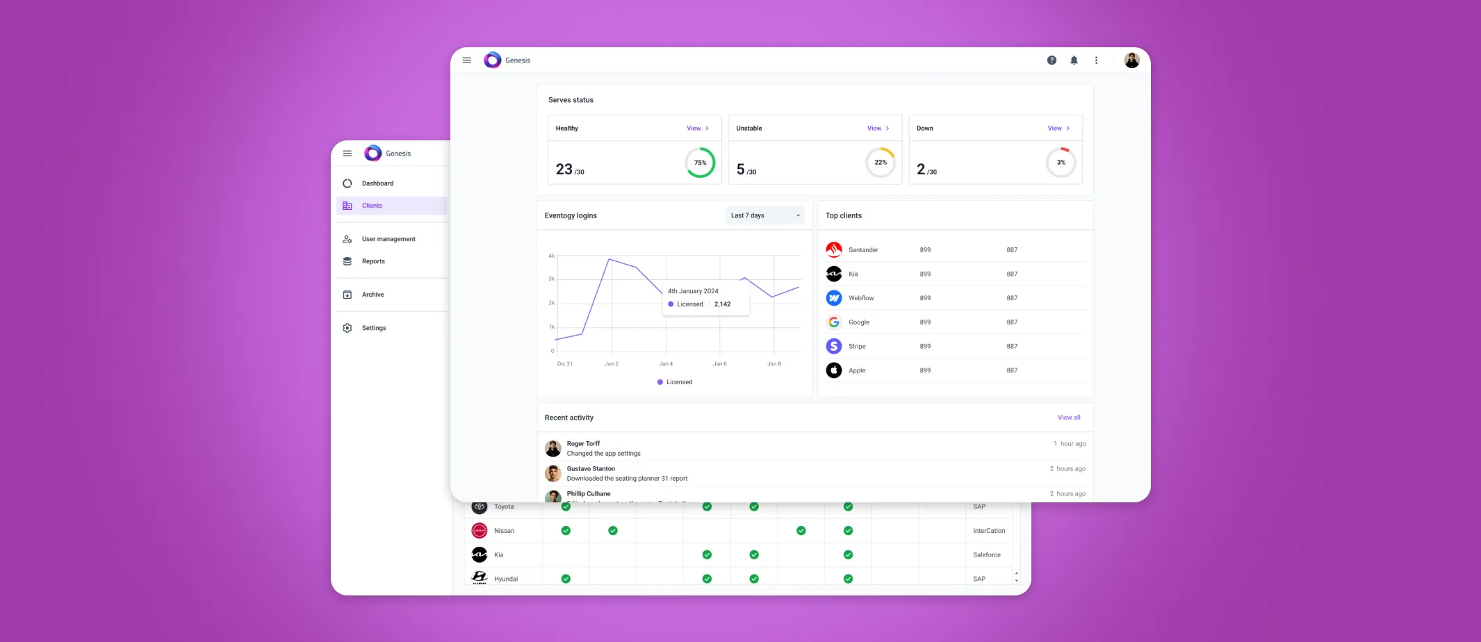
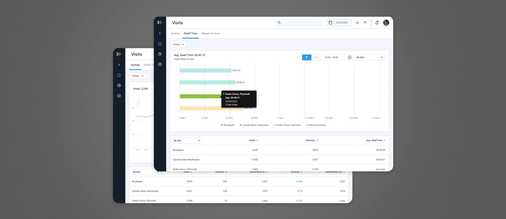
Car park insights dashboard
A comprehensive dashboard upgrade
Overview
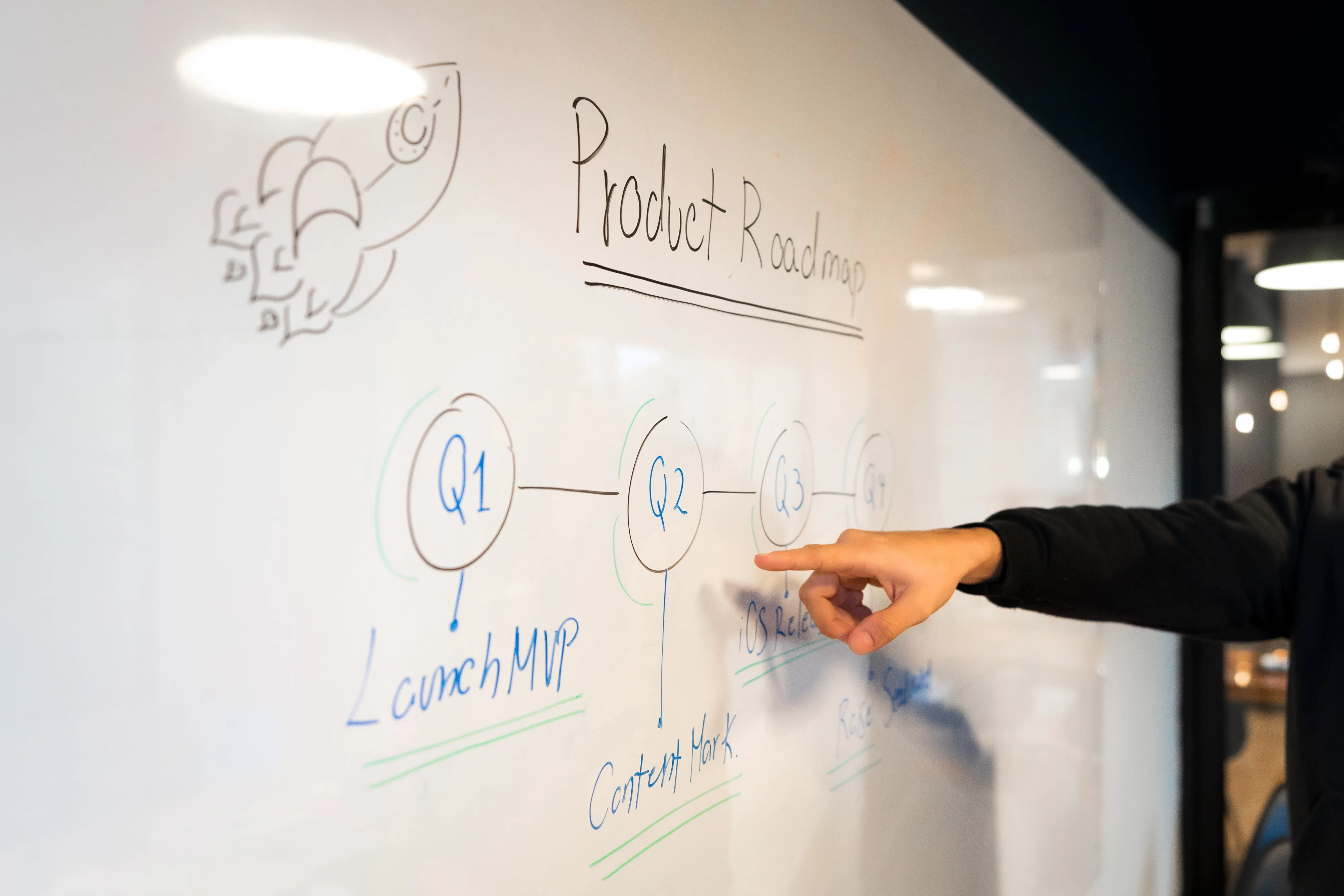
In February 2022, working closely with the Head of Data, we bring up several issues before to progress further requirement, proposing a phased approach to deliver a faster turnaround on initial improvements (Phase 1), and then in parallel we can begin work on planning larger scale improvements (Phase 2).
Phase 1
Focuses on functional aspects by making improvements to the UX/UI for scalability and to better enable existing functionality.
Phase 2
Focuses on a larger scale review of the overall look and feel of Insights, including additional screens and functionality enhancements.
There were several issues within the UX/UI
Multiple solutions were not scalable
Inconsistent Charts or colours behaviour
Poor data read for comparison
The users and their roles
Internal User
Tim, an Internal user: he accesses the insights feature to review the volume of movements and visits from the vehicles across all client sites.
Admin User
Lara, a B2B user: can review the volume of movements and visits across her company's sites with insights.
Streamlined Feedback and Analysis Initiative
Reviewed existing solutions
Collected feedback from the team
Discussed requirements with the Business

Choosing the right charts
We carefully examined the advantages and limitations of each chart to ensure scalability in various scenarios, especially when users customize the type of data they wish to visualise.
Line Chart: Visualises trends over time
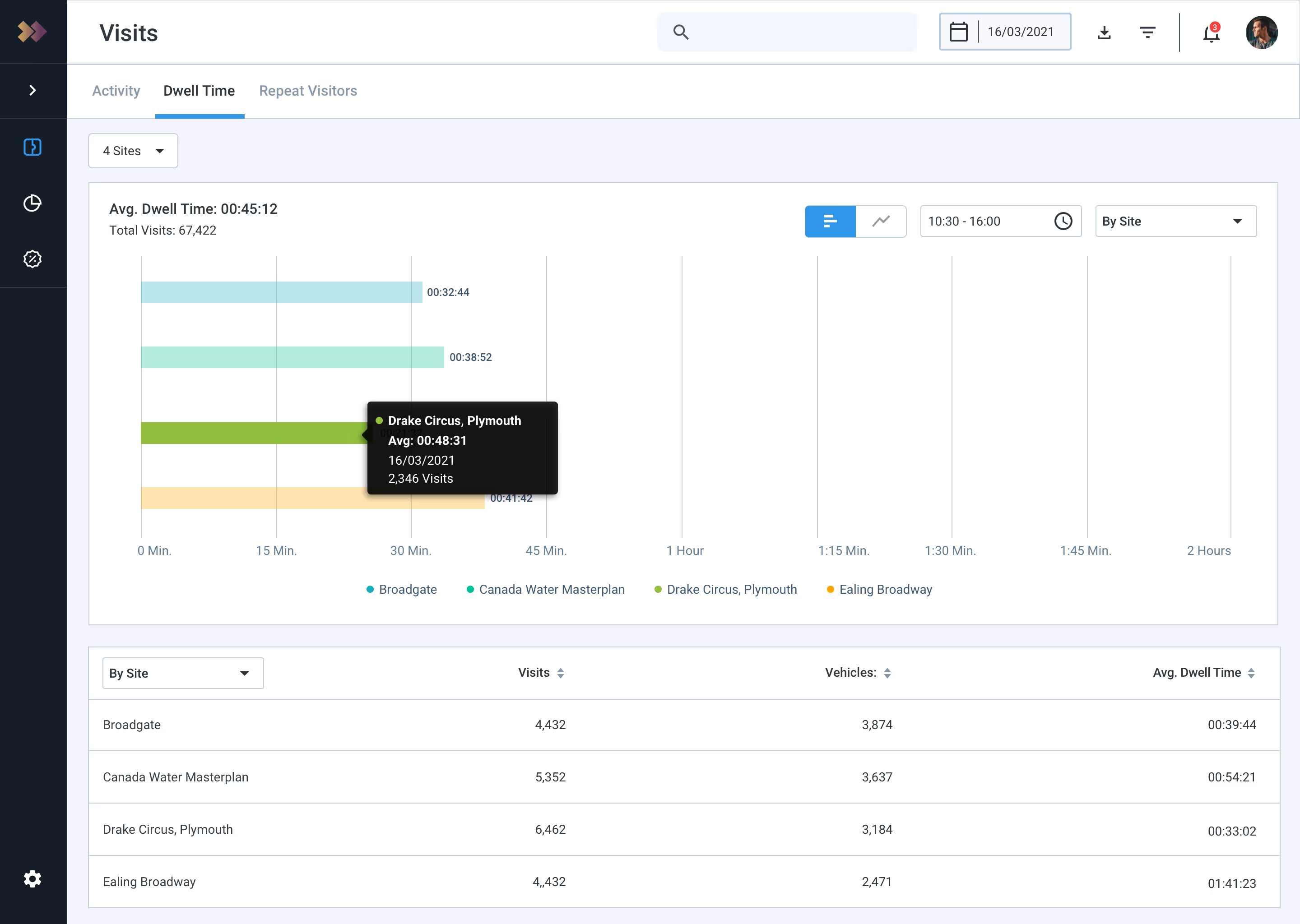
Bar Chart:Compares discrete quantities
Donut Chart: Illustrates percentage distribution
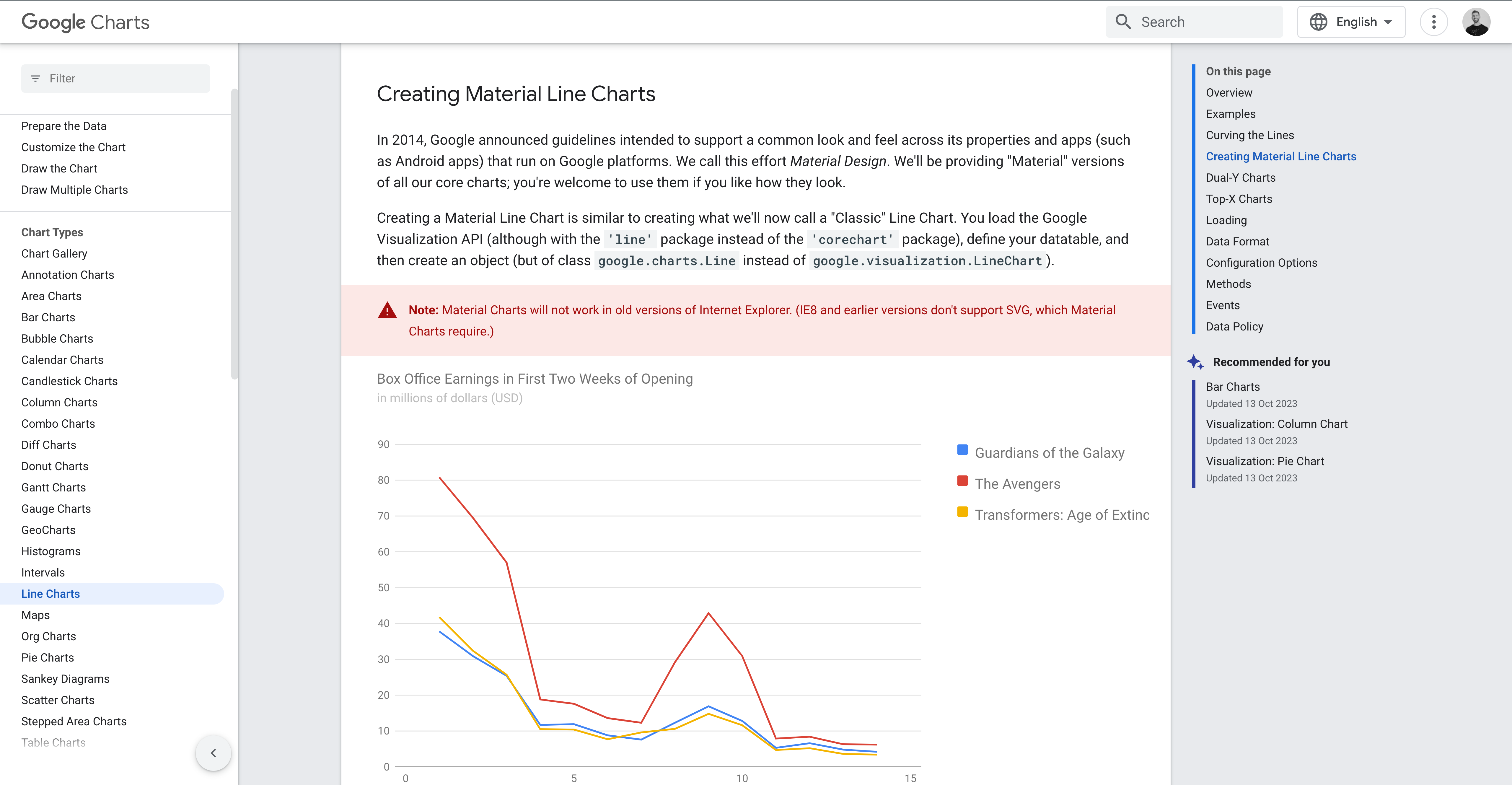
Reviewing exiting products
Google Monitoring offers comparable functionality for customising extensive datasets. In our analysis, we sought to comprehend the rationale behind the chosen approach for handling substantial amounts of data.
Recommend using a data table to track movement counts
Implement categorised filters for better organisation
Enhanced space UI utilisation
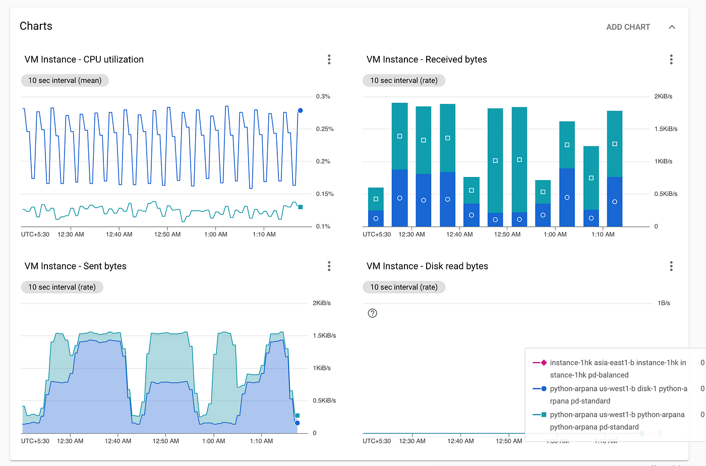
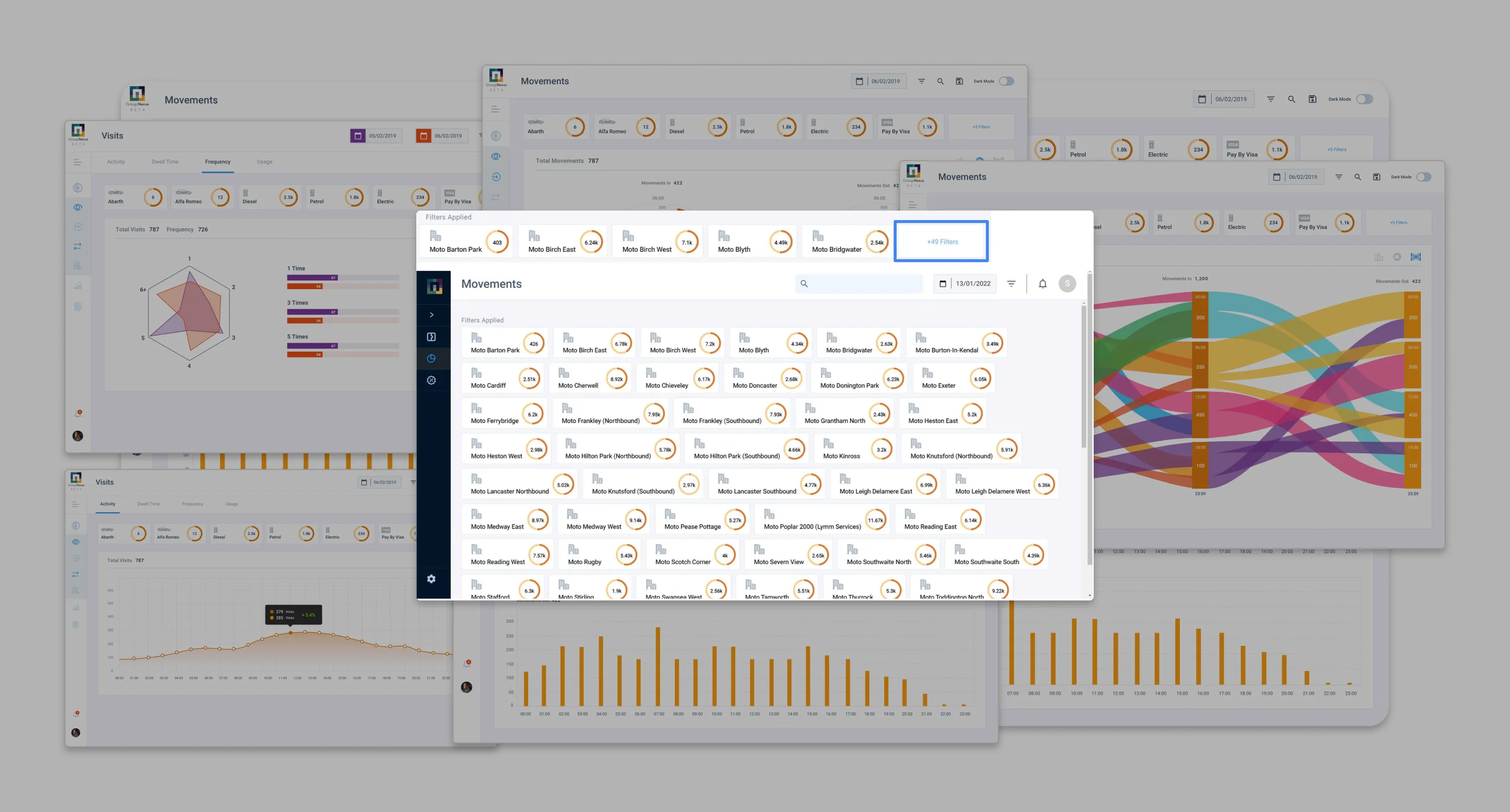
A UI component experiencing scalability issues
Applied filters were displayed on the main screen, containing too much information and not suitable for such complexity.
Donut-chart behaviour inconsistent if 2nd period applied
Limited functionality with mouseover
Not user-friendly when more then 10 filters were selected
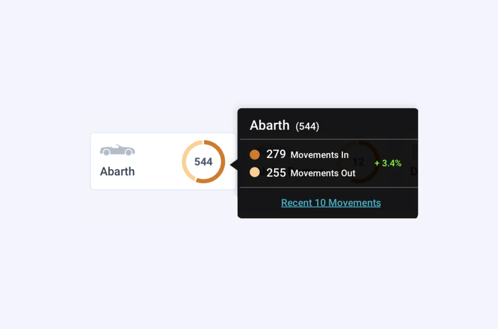
We created new component
Extensive exploration of design materials, forums, and rigorous testing led us to discover a much better alternative.
Recommend using a data table to track movement counts
Implement categorised filters for better organization
Enhanced space UI utilisation
Data Table Reveals the Whole Story
Enhancing functionality and improving data comparison with this advanced component.

We validated the new design through user testing
We made sure to test all the new feature variations with users throughout the process to make sure they were happy with the new enhancements and the overall experience before presenting to the stakeholders and Dev-team.

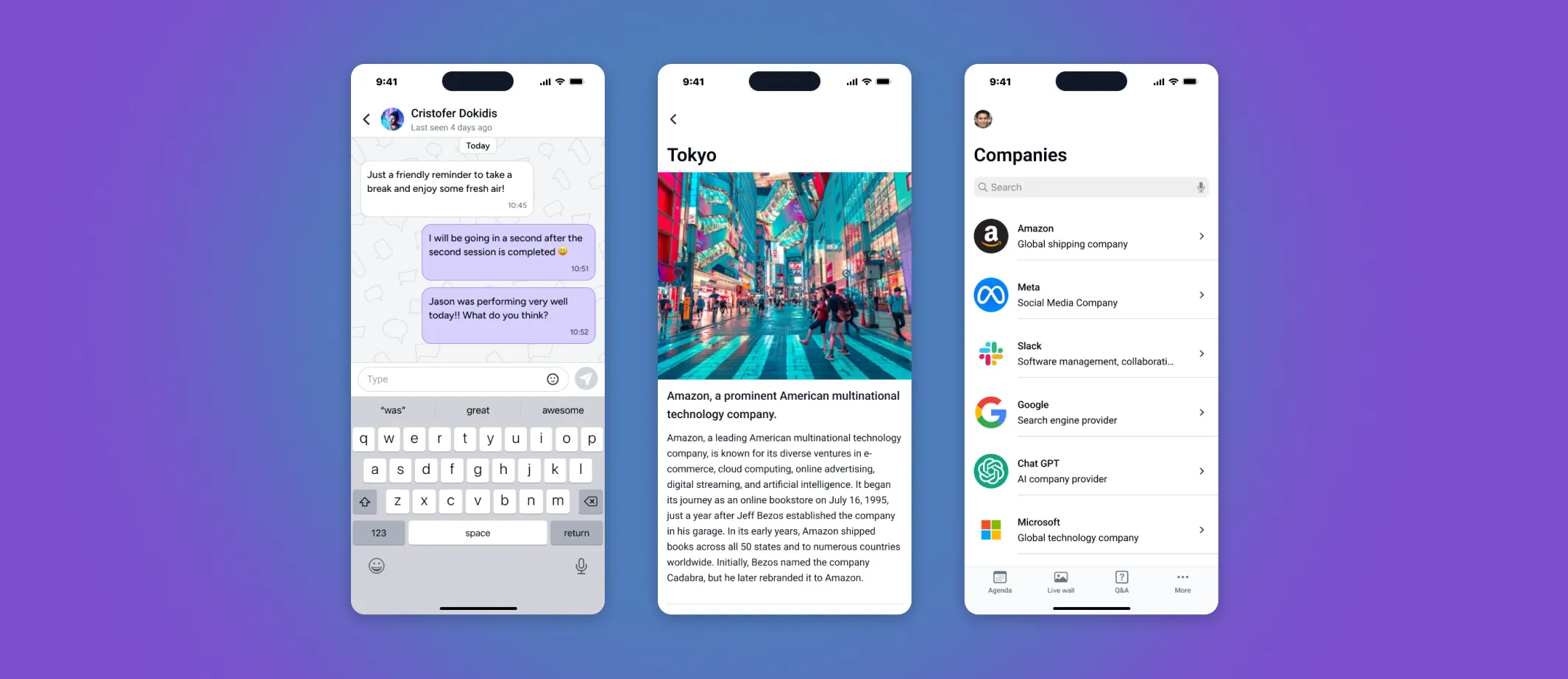
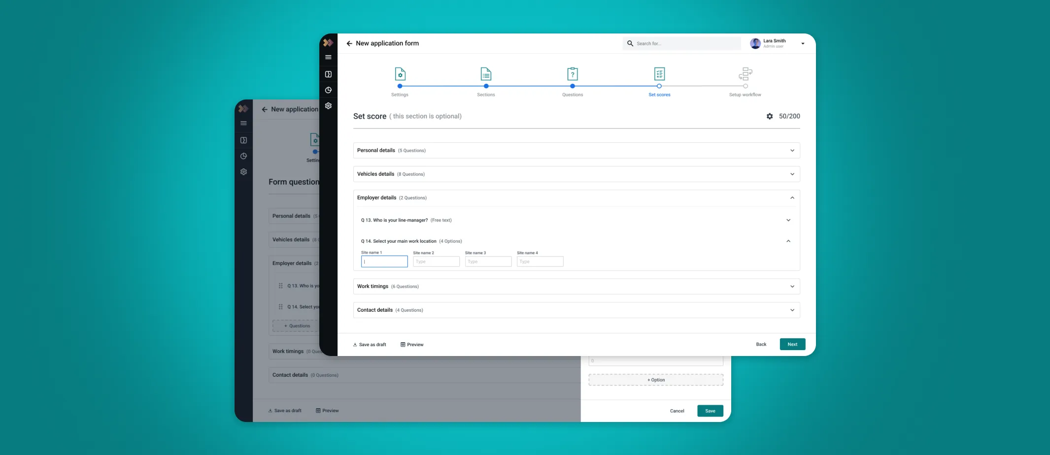
Image Gallery
Extra screens for the new designs.
PORTFOLIO

