Event Management Platform
The company
Core principles and future goals
👨🏻💻 My role
I led the end-to-end design process, working closely with the Product Owner and Product Manager within a cross-functional team. As the founding designer, I built the product from the ground up and delivered a robust, well-documented design system.
😤 Problem
The existing platform was limiting their ability to improve functionality and was overly complex for users, as it was initially designed by developers.
🧐 Objective
Revamp the outdated platform by integrating essential features and incorporating AI capabilities for the MVP. Ensure the redesign adheres to UX best practices and meets high accessibility standards.
The users
Super admins
B2B user: These users have full access to multiple features with a paid license. They are responsible for managing all their corporate events.
Admin user
B2B user: Assists the Super Admin user by providing support with a free license, but they have restricted and limited access to the platform.
Support
Intenal user: they provide support as admin users to clients in planning and managing events when challenges arise.
Attendee
B2B2C user: These are attendees who participate in the event, engaging in surveys and live polls.
Plus ones
B2B2C user: They are guests of the attendee and can only attend the event. They do not participate in live polls or surveys.
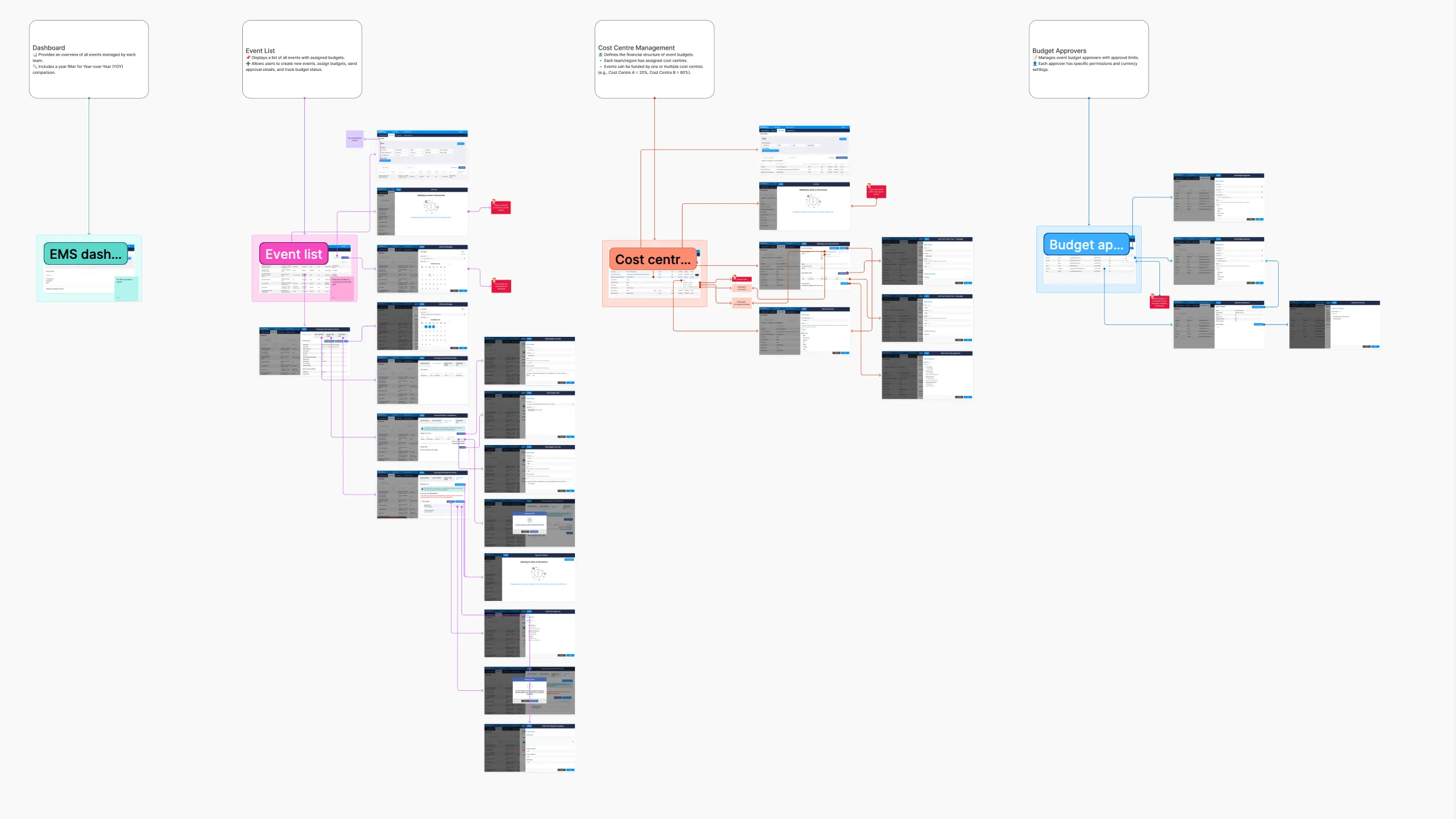
Process overview
Exploration
I dedicated an entire week to using the existing product, gaining expertise in its functionalities and identifying challenges.
Ideation
Once I understood the platform, I organised and documented my findings, asking numerous questions to brainstorm ideas and validate my design suggestions.
Design & validation
I collaborated with the team to develop solutions, ensuring expectations and requirements were aligned. We validated these through design reviews and real user testing.
Original product
The interface initially felt overwhelming, lacking a clear hierarchy to indicate the most important elements. Features were scattered throughout, added over time based on client requests without a scalable plan, resulting in a messy and chaotic product.
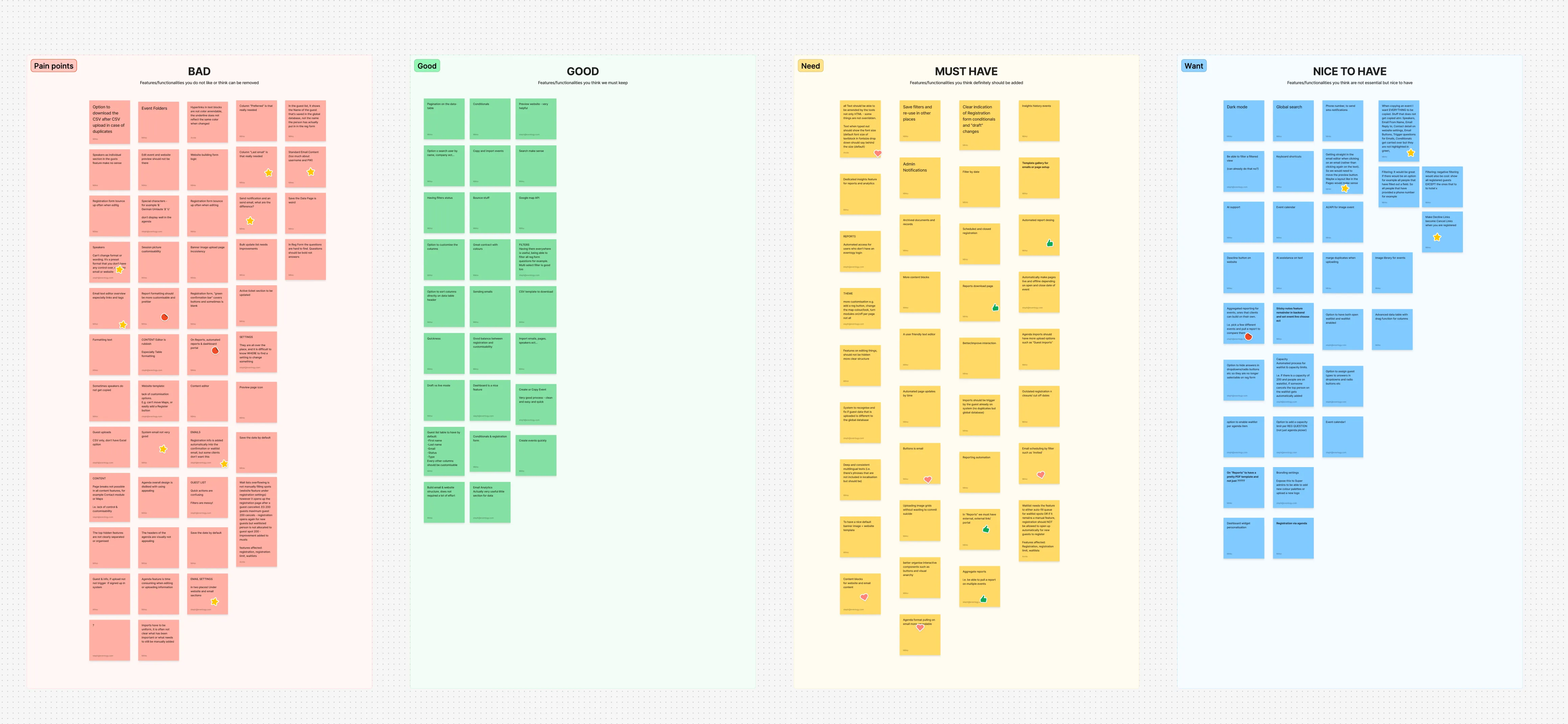
Design workshop
After reviewing the platform, I held a workshop with the support team. They were frustrated with faulty tools, often needing workarounds or manual coding. Some features were simple but time-consuming to fix, while others, like a website builder, posed significant challenges.
Challenges and constraints
Navigating the project wasn't always straightforward, and we faced several constraints that required careful decision-making.
Dev constraints
Dev constrains
Dev constrains
A key technical constraint was the save process. The back end initially required manual saves and did not support autosave. We kept this approach temporarily to evaluate user impact, then implemented autosave once it was clear the friction justified the change.
Tight deadlines
Tight timelines
Building within time constraints
Due to tight time constraints across research and development, the design process had to closely align with what could realistically be built within the available timeframe. This meant shaping the solution around existing patterns and components, ensuring it wasn’t overly complex or time-consuming to implement. For example, instead of designing highly custom components, I worked with the existing data table components to deliver a practical, scalable solution that met user needs while staying efficient for development.
Client guidelines
Clients guideline
Client guidelines & user permissions
Client constraints included strict brand colour palettes that had to remain consistent across event emails, the website, and the iOS app, along with dynamic content requirements that varied by country and user permission levels.
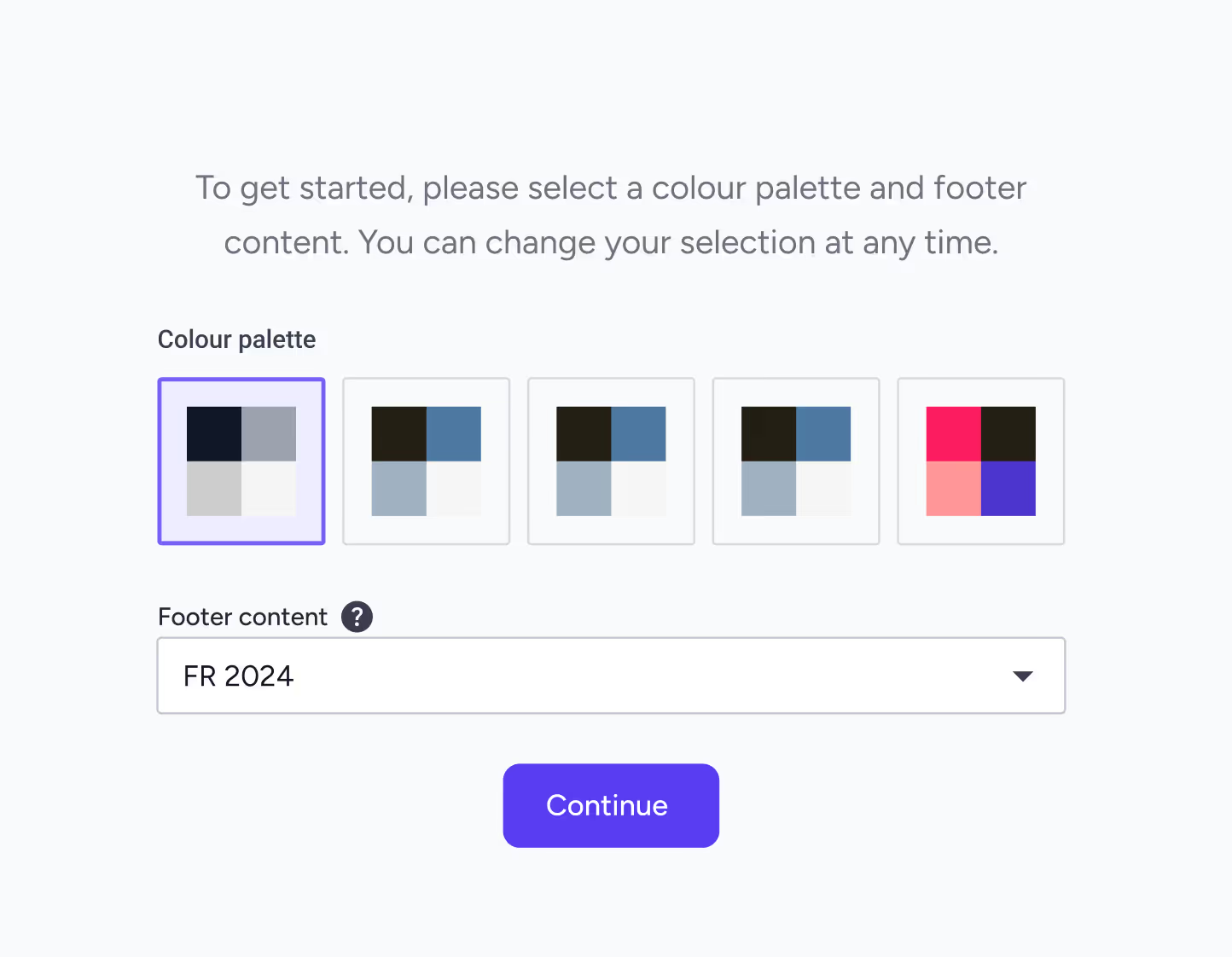
MVP priorities
MVP
We prioritised essential features for the MVP.
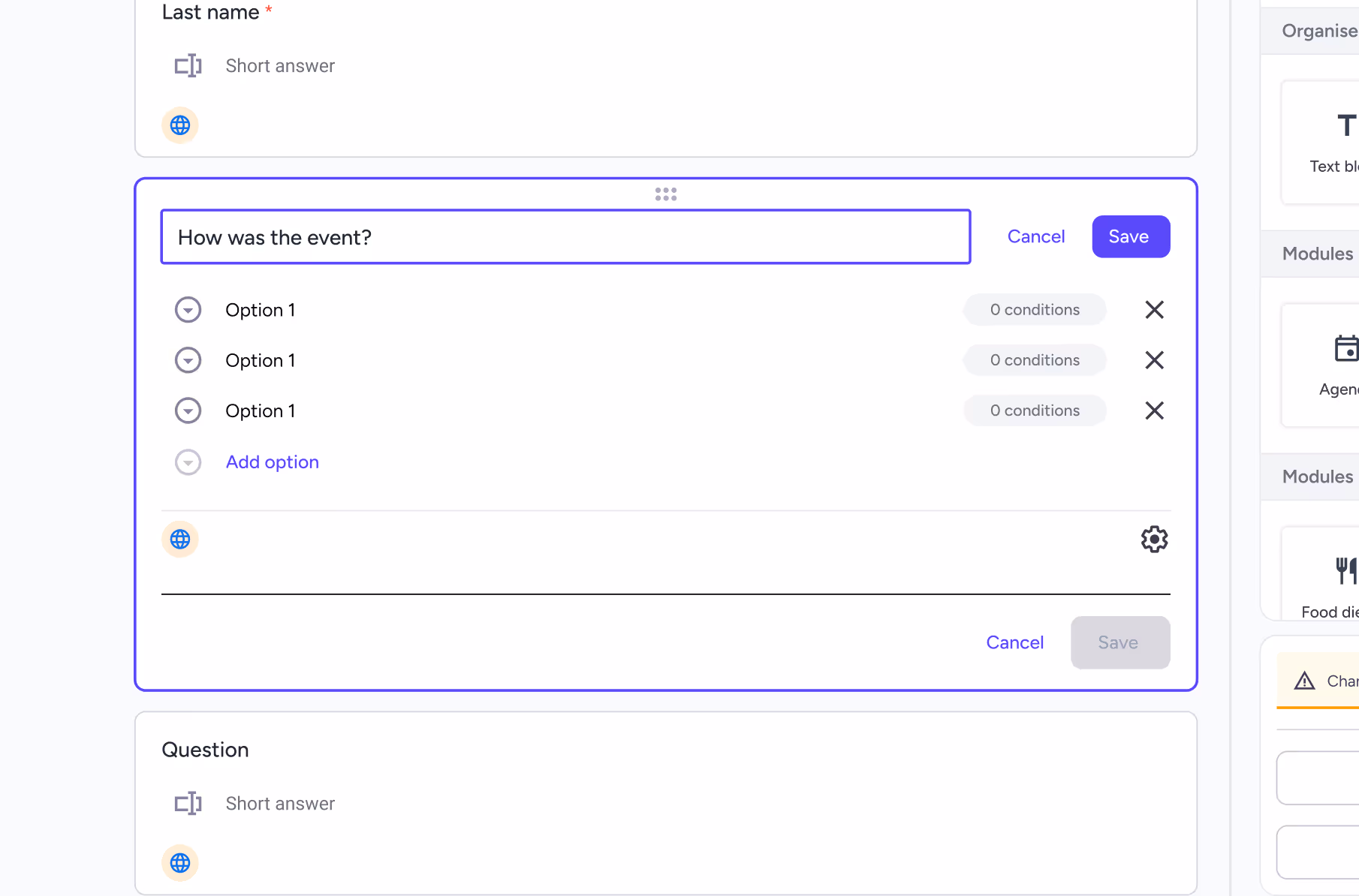
I designed screens and explored multiple solutions, ensuring each met both user needs and business requirements. We conducted user testing with the internal team and real users through an online service to observe pain points and areas of struggle. To ensure consistency and smooth collaboration with developers, I created a comprehensive design system. This also helped guarantee the product was user-friendly, accessible, and aligned with established UX standards.
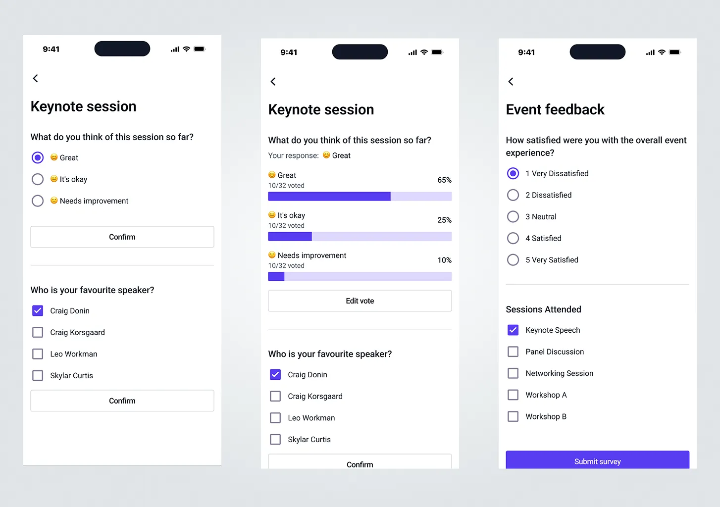
I developed mock-ups informed by my research findings.
I designed screens and explored multiple solutions, ensuring each met both user needs and business requirements. We conducted user testing with the internal team and real users through an online service to observe pain points and areas of struggle. To ensure consistency and smooth collaboration with developers, I created a comprehensive design system. This also helped guarantee the product was user-friendly, accessible, and aligned with established UX standards.
.webp)
How we tested?
Moderated
A facilitator guides participants through tasks, allowing for in-depth, real-time probing of behaviours and motivations.
Unmoderated remote
Participants complete tasks on their own time, often recorded via screen-sharing software, providing faster, more cost-effective, and quantitative data.
In person
Users are observed in a controlled environment, ideal for detailed observation and, in some cases, biometric data.
Tree testings
Evaluates the structure of a site or app to see if users can find information easily.
Diary studies
A longitudinal method where users log their interactions with a product over a set period.
Card sortings
Users organise topics into categories to help inform information architecture.
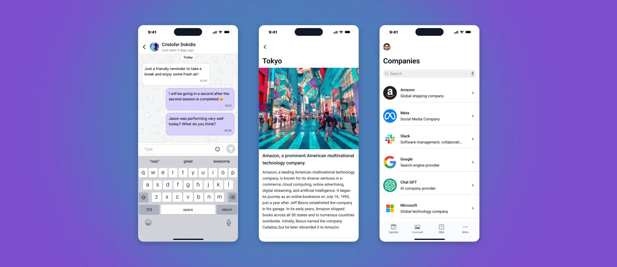
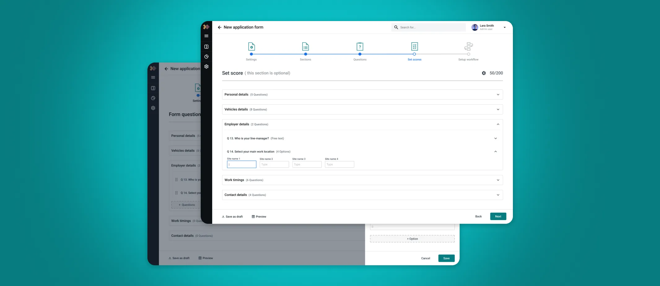
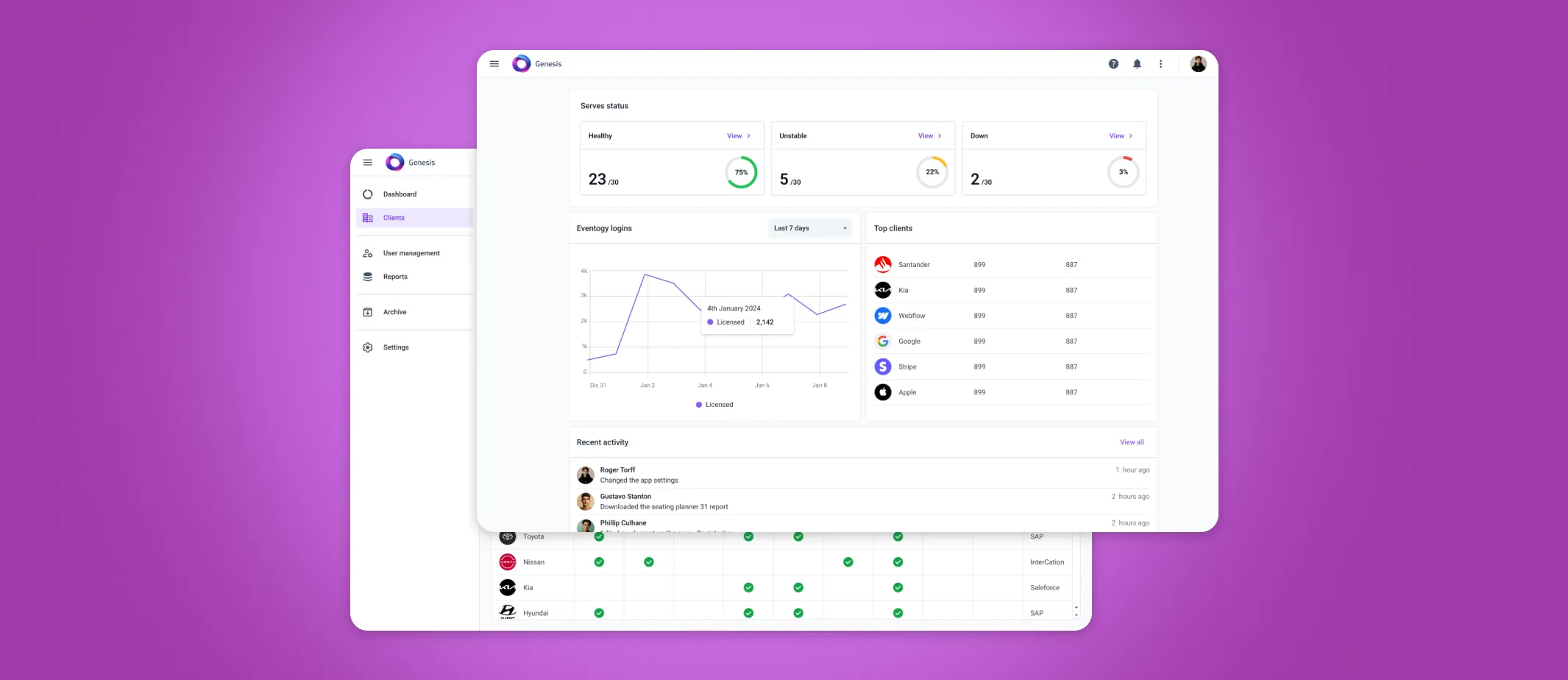
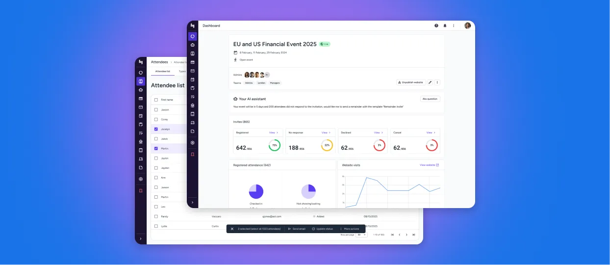
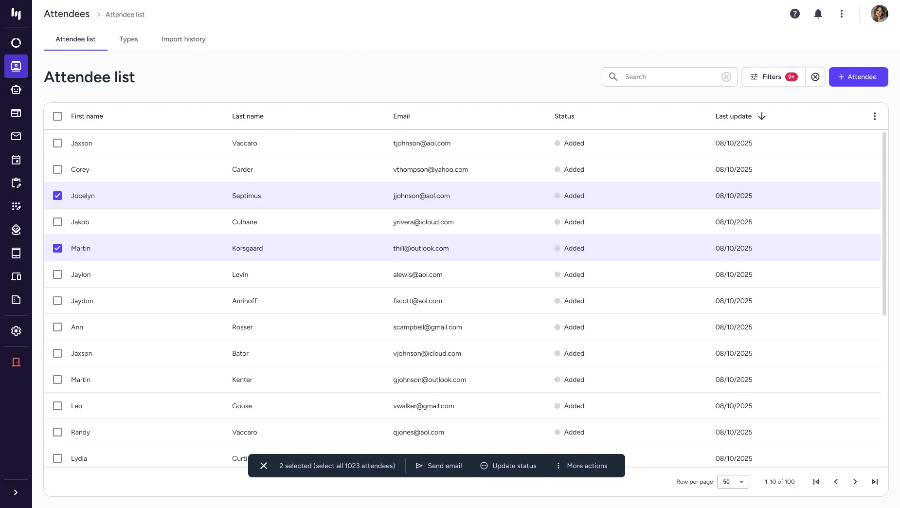
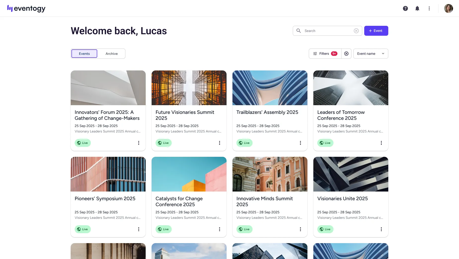
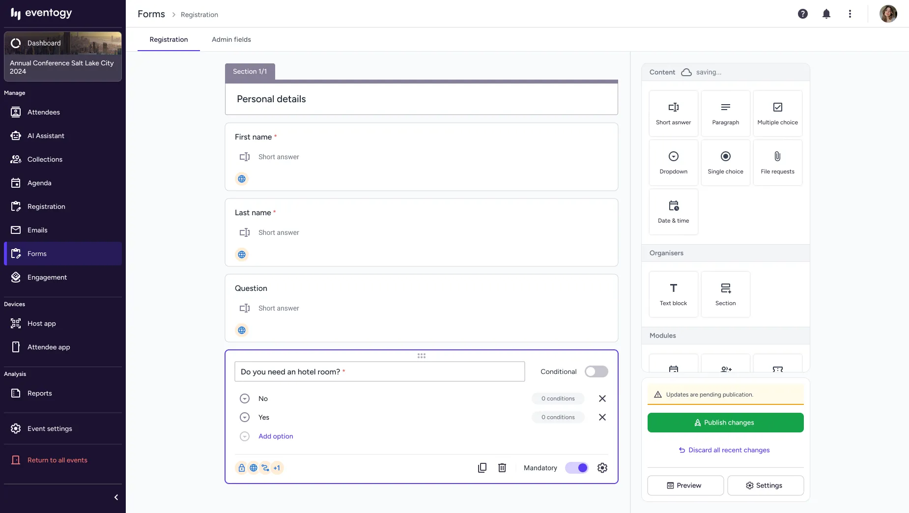
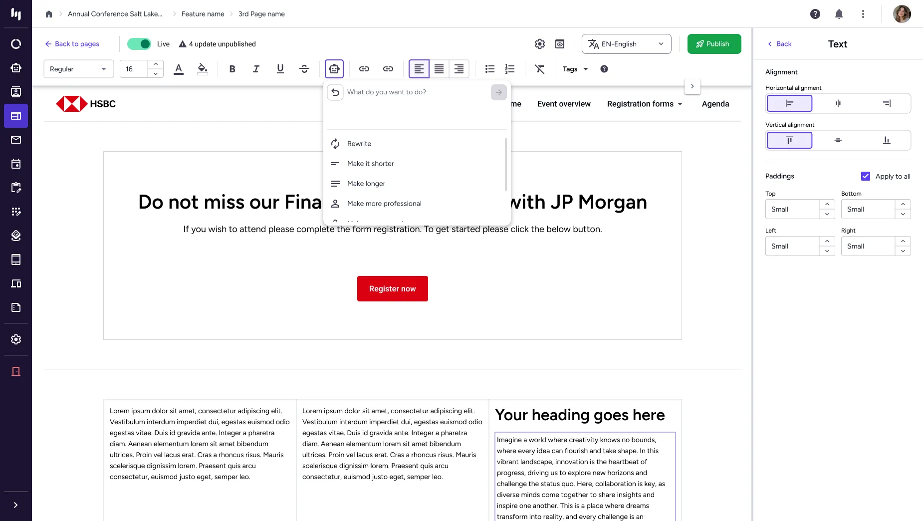
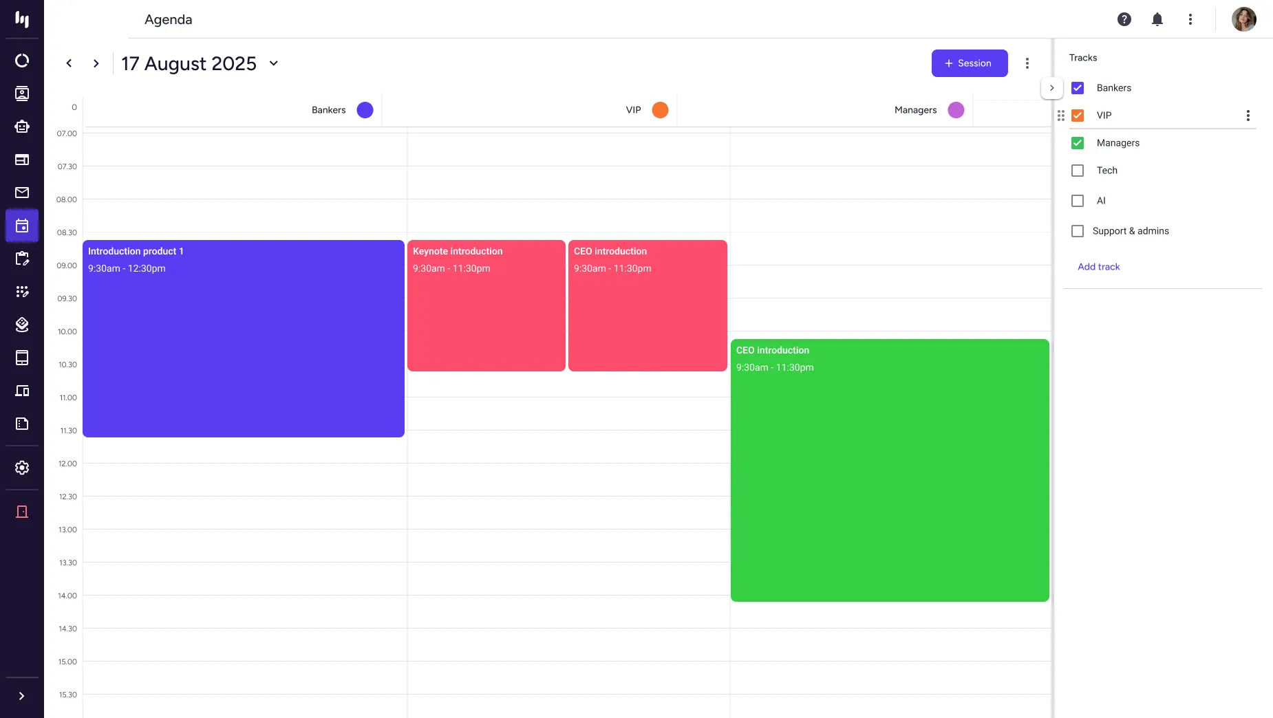
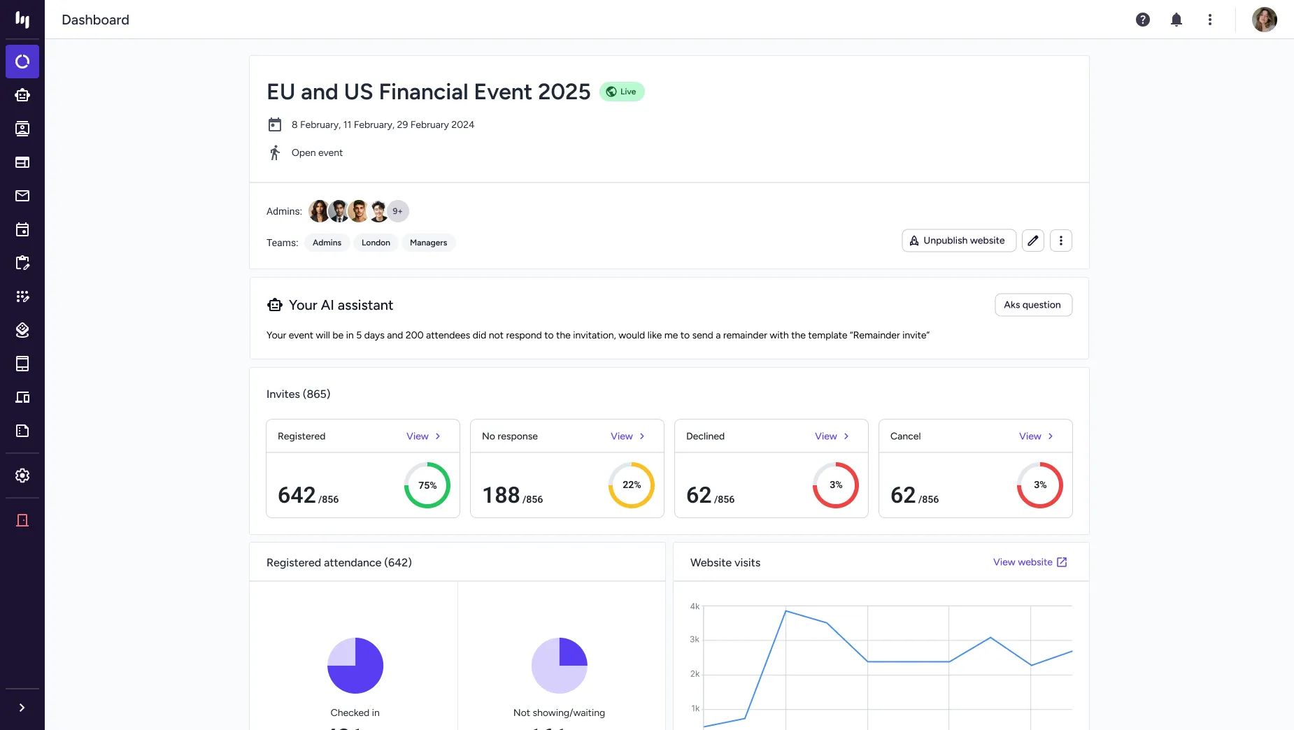
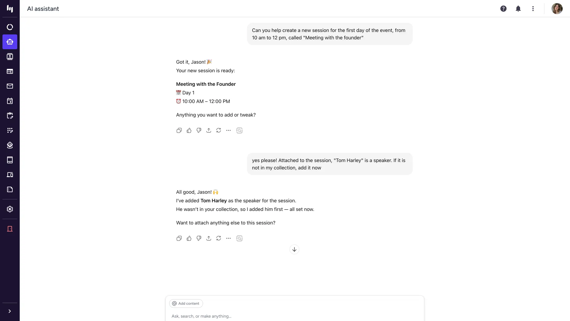
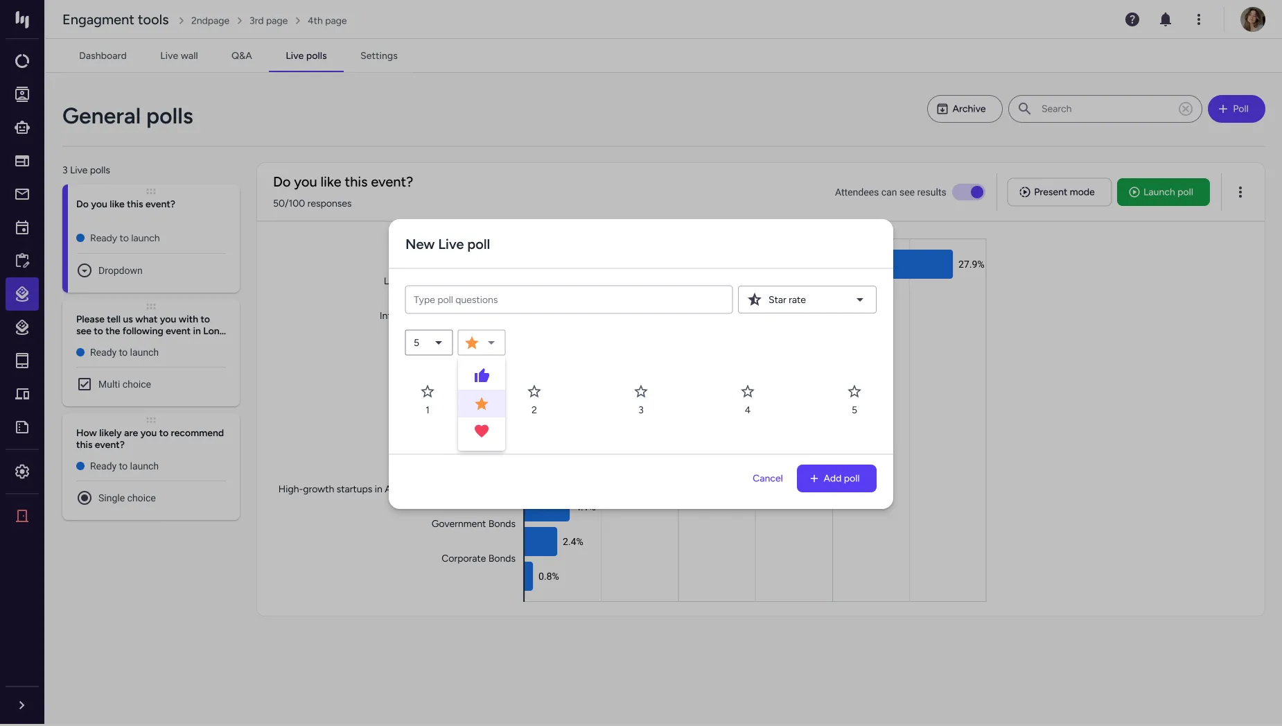
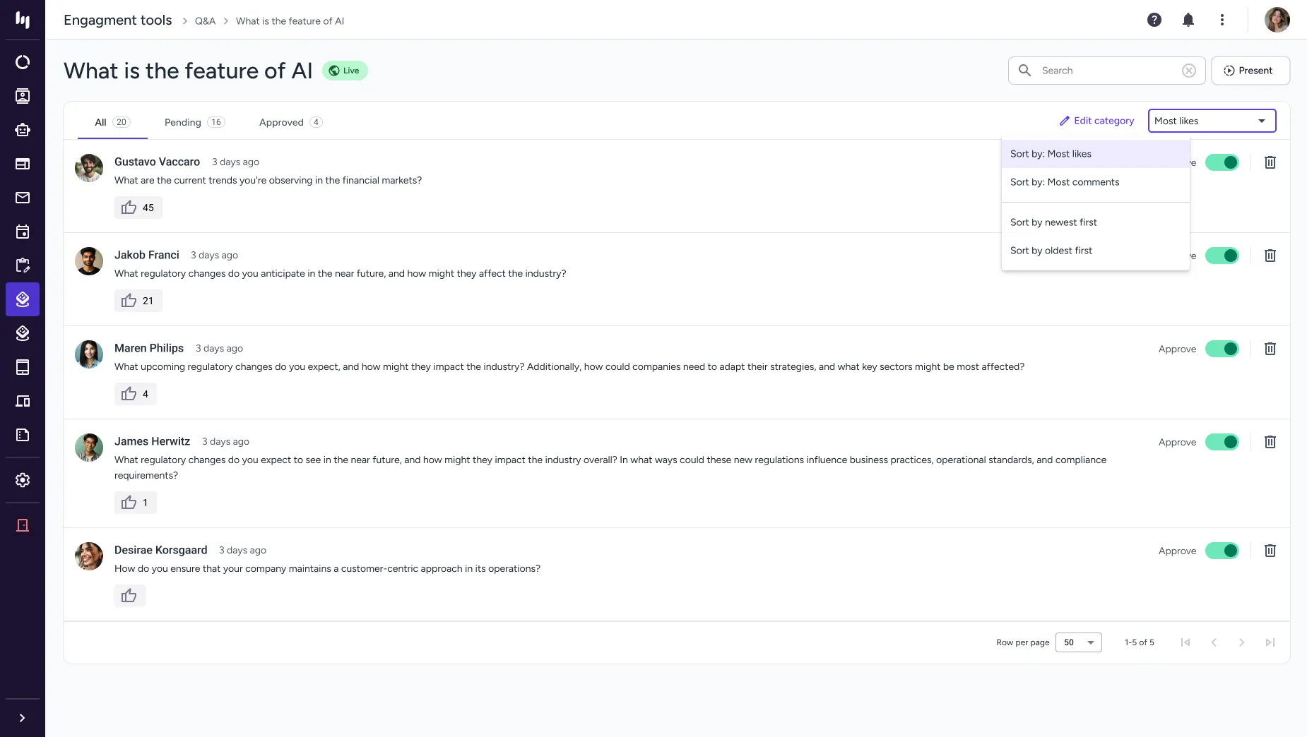
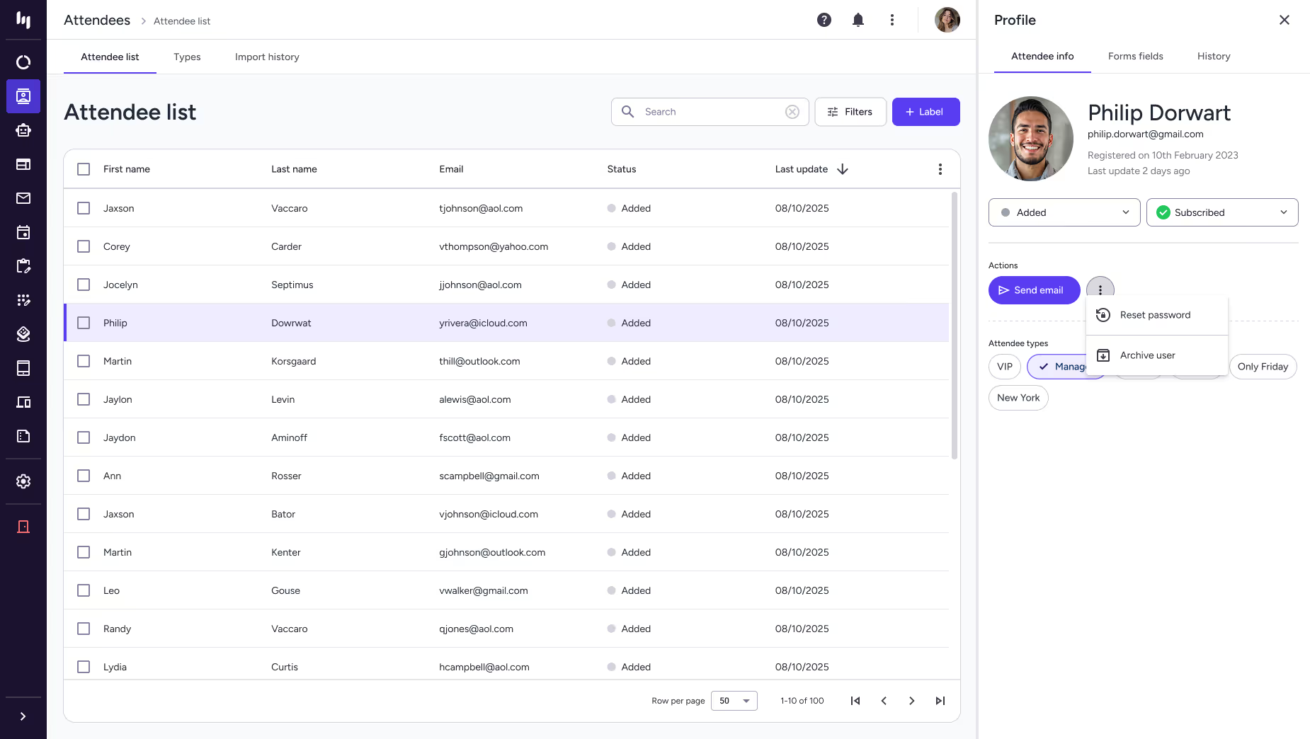
Final product
Here are some of the key screens from the platform.
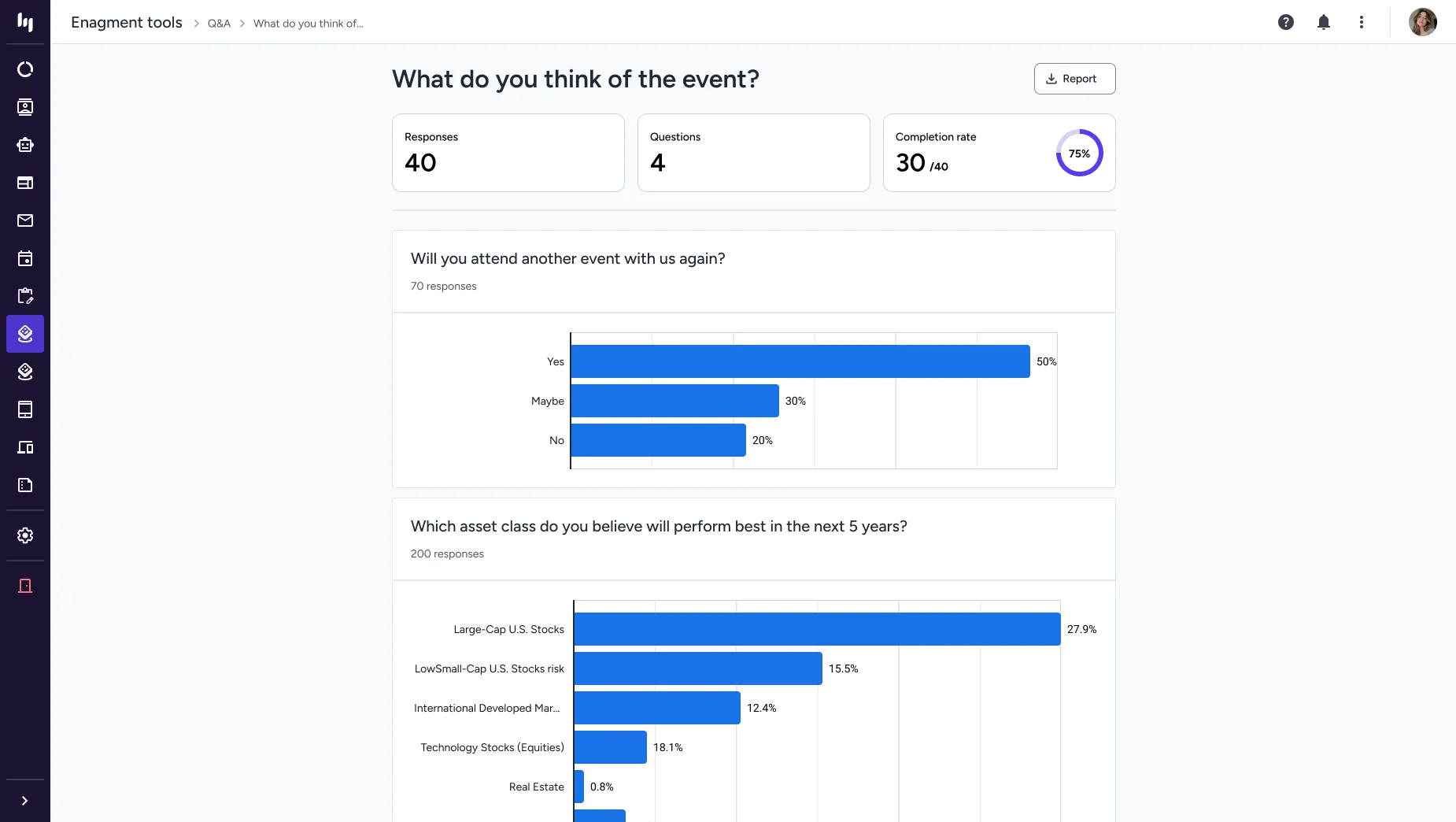
Results
To evaluate the impact of the redesigned Eventogy platform, I used a set of standard, measurable UX and product metrics. These provided a clear view of how the new interface improved efficiency, reduced friction, and supported both users and the business.
Completion Time
Tracks time to create events or complete key workflows; average time dropped from 35 min to under 15.
Success Rate
Measures of error-free, unassisted task completion improved from 10% to 80%.
Error Rate
Counts mistakes in key workflows, showing a 45% improvement in user reliability.
Support Ticket
Measures decreases in support requests tied to confusing interfaces or workflows down by 67%.
Adoption Rate
Measures adoption of redesigned features, improving from 2/5 to 4.5/5.
Onboarding Time
Measures how quickly new users become productive, improving from 1.5/5 to 4.5/5.
Accessibility
Assesses accessibility improvements against standards like WCAG, rising from 45/100 to 95/100.
Design System
Measures alignment with the new design language, with DCR increasing from 35% to 88%.
User Satisfaction
Captures user sentiment on the redesigned experience, improving from 4/10 to 8.5/10.
PORTFOLIO